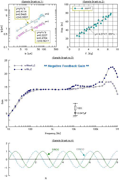

Four kinds of graphs are arranged together by copying and pasting them. In this way you can create various graphs by using PlotTool. The kind of the no1 graph's axis is log. No2 and no3 are semi-log. And on the no1 and no2 graphs the regression curves are drawn using the method of the least squares. On the no2 and no3 graphs the regend objects for groups of plotting data are drawn.

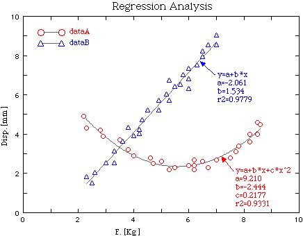
This graph shows a sample of the Regression analysis using the method of the least squares. The regression curves and their related constants are also drawn with plotting data. To use the Regression analysis, you select a target graph and choose the Symbol&Line... item from the Object menu. And then on the Symbol&Line dialog, which appears after that, you can do the settings for the Regression analysis.

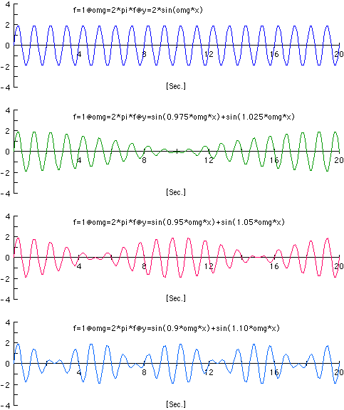
Using Multi-graph function, you can create multiple graphs up to four at once. (Choose Multi from the Graph size pop-up menu on the WorkSheet dialog.) In this case, since a common scale is applied for each graph, the graphs which are related one another for scale are only available. The data of these graphs are created by using the Calc.f(x) function, which is the function for calclating any numerical expression. The data label above each graph indicates the expression which was defined on the Calc.f(x) dialog when each group of data were calclated.
