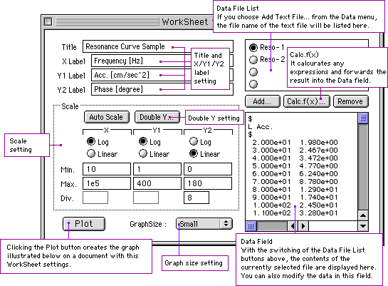
Before you create new graphs on a document, you have to set some items on the WorkSheet dialog as follows. First, you set input data by some of the ways listed bellow.
- Enter data into the Data field from the keyboad.
- Specify text files. ( Add... )
- Calculate expressions. ( Calc.f(x)... )
Then you need to set the several items in the scale part. And choose a proper graph size from the GraphSize pop-up menu. Typing a title and labeles into the upper left part is optional. If you want to change the initial settings for drawing graphs, choose the Preferences... item from the Edit menu and do appropriate settings. After setting the above, Click the Plot button.
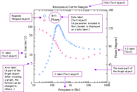
If you click the Plot button after the setting the above, the following graph Object and the related Text objects will be created on a document. After creating them the following operations for the objects are available.
For the Graph object:
- change the scales.
- change the combinations of symbols and lines.
- change the axis settings.
- apply Regression Analysis.
- apply Direct Plot ( to add data after creating a graph ).
- have the Regend objects shown or hidden.
For the Text object:
- change the font, style, size and direction.
For each object:
- change the position and the size.
By selecting a proper tool from the Tools palette, you can create every object except the Graph object.
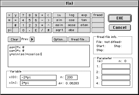
You can calculate any numerical expressions including mathematical functions and use the results as plotting data. If you choose the Calc.f(x)... item from the Data menu ( or click the Calc.f(x)... button on the WorkSheet dialog ), a dialog illustrated bellow will appear.
So enter a desired expression, a range of the variable x and the number of data into the particular fields. Finally, if you click the EXE button, the results will be transferred into the Data Field on the WorkSheet dialog.
The fread() function, which was newly added on version 1.5, allows Calc.f(x) to use data in a file. Inserting fread() into expressions enables you to plot pure data of the external file, processing them numerically. If the fread() function is used in the expression field, you need to click the fread file... button to define a target file.
Go back tothe top of this page.
Using any tool on the Tools palette, the following object except the Graph object can be created on a document.
(1) Text object
(2) Line object
(3) Rect object
(4) Oval objectConcerning the objects of (2), (3) and (4), the line width option, which can be used by choosing the obtions... item from the Object menu, is available. And for the all objects above, you can apply color to them using the color palette.
The Axis Value Reading tool allows you to read a pair of axis values which the pointer indicates on a graph object.
The Click Mag tool enlarges quickly the scale of a graph object around a clicked point. With the first click the scale is enlarged two times. With the second click it is enlarged four times. Clicking with the option key restores the enlarged scale.
Direct Plot allows you to enter data for a graph which was already created. The entered data are plotted onto the graph with a particular symbol one after another. Changing scales of the graph, saving the document which includes the graph and doing others are also available while Direct Plot works.
After selecting the target graph, choose the Direct Plot... item from the Object menu. Then the dialog illustrated bellow appears. In this dialog you can do several settings for the Direct Plot function. Those are data labels, the kinds of symbols and their colors, the number of plotting data groups(1 or 2), the kinds of the Y axis and whether entered data will be saved or not.
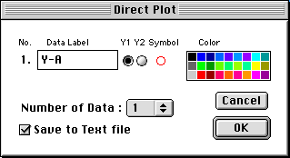
If you click the Ok button, each corner of the target Graph object is marked and then the floating window illustrated bellow will appear. Enter data, which consist of a x datum and one y datum or two y data, into the input field of the window. (To move the insertion point to another field, press the tab key. To plot the entered date on the Graph object, press the Return or Enter key. Entering data can repeat up to 1000 times. ) As soon as you entered the data, they are plotted on the Graph object. (When you cancel the data which have already been entered, click the Undo button. Undo can be applied up to for the first entered data.)
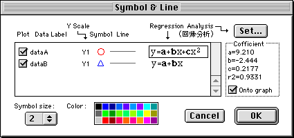
In the Symbol & Line Dialog you can do several settings about symbols and lines for plotting data. Also the settings for the Regression analysis can be done in this dialog.
After setecting a target graph, choose the Symbol&Line... item from the Object menu. To change the type of symbols or lines, you need to select the symbol or line icon on the column for a group of plotting data, and click either the upper or lower part of the arrow icon which appears next to that icon. And if you select any color on the color palette under selecting the symbol or line icons, the color of corresponding symbols or lines will be changed.
If the check box on each column is selected, the corresponding plotting data are to be plotted. If you don't want to plot them, reset the check box.
You can change the size of symbols by choosing a proper size on the Symbol Size pop-up menu. Three sizes ( 1, 2 and 3 ) are provided.
If you select the item of the Regression analysis on each column and click the Set button, the dialog for the Regression analysis will appear. You can choose a desired curve type on this dialog. After clicking the Ok button, the type and the coefficients for the regression curve are displayed at a proper location on the Symbol & Line dialog. ( If you want to draw the coefficients of the regression curve on a graph, select the "Onto graph" check box in the "Cofficient" box. )
